

Art does more than fill a wall. The colours within a painting can shift the entire feeling of a space, making a room feel warmer or cooler, more energised or deeply calm. Colour is one of the most instinctive things we respond to, often before we have even registered what a piece is depicting. Choosing art with intention means understanding not just what you love visually, but what you want to feel when you walk into a room.
Warm Tones: Energy, Comfort, and Life
Reds, oranges, yellows, and deep earthy tones bring heat and vitality into a space. A painting rich in warm colour can make a large, sparse room feel intimate and lived in, or give a neutral space the pulse it was missing. These tones tend to stimulate conversation and appetite, which is why they work so well in dining rooms, kitchens, and social spaces. At their boldest they energise, and at their most muted they wrap a room in something that feels close to firelight.
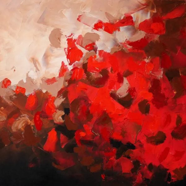
Redsky- 30×40 inch abstract art by Preethi Mathialagan

Cool Tones: Calm, Clarity, and Breathing Room
Blues, greens, and soft greys have the opposite effect, opening a space up and slowing it down. Cool toned art brings a sense of clarity and ease that makes it ideal for bedrooms, bathrooms, and any room where rest or focus is the goal. A seascape in pale blue or an abstract in soft sage can lower the temperature of a room in the best possible way, creating the kind of atmosphere that invites you to exhale. These colours also have a timeless quality that makes them easy to live with over many years.
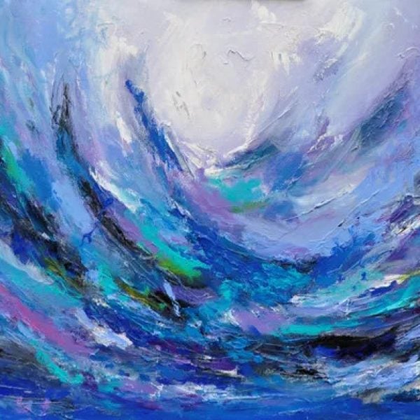
Spark in the sea by Preethi Mathialagan

Neutral and Earthy Palettes: Grounded and Enduring
Art built around creams, browns, ochres, and warm greys has a settling quality that works in almost any space. These palettes feel rooted and unhurried, adding depth and texture without demanding attention. Neutral toned art tends to age beautifully alongside a room, shifting subtly as the light changes throughout the day. For spaces that need to feel collected and calm without leaning into a particular colour story, earthy and neutral works are often the most considered choice.
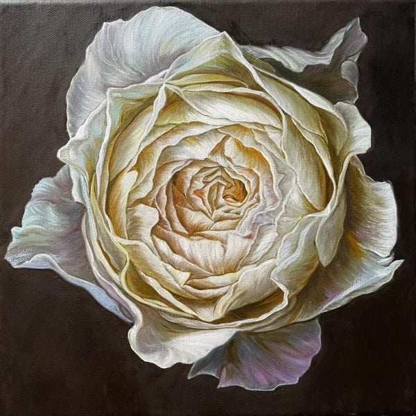
Cream rose on dark brown background by Elena Podmarkova
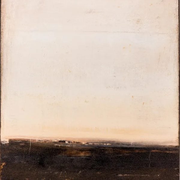
Brown abstract painting MP632 by Radek Smach
Bold and Contrasting Colour: Drama and Intention
Some art is designed to stop you in your tracks. Paintings built on high contrast or unexpected colour combinations bring drama and confidence to a space, signalling that the room has a point of view. A single bold work can anchor an entire interior, pulling together furniture, textiles, and accessories that might otherwise feel unconnected. These pieces work best when given room to breathe, a generous wall, clean surroundings, and an owner willing to let the art lead.

The Autumn arrives by Cristina Stefan

Monochromatic Works: Sophistication and Focus
Art that works within a single colour family, whether deep navy, forest green, or warm terracotta, brings a quiet sophistication that layered palettes sometimes cannot. Monochromatic works draw the eye into their tonal variations, revealing depth and nuance the longer you look. In a room that already has a lot going on, a monochromatic piece can provide focus without adding visual noise. In a simpler space, it becomes the quietly confident centrepiece that holds everything together.

Rustic Landscape by Silvia Vassileva
Let the Colour Lead
Choosing art by colour is not a shortcut, it is one of the most intuitive ways to curate a space that feels genuinely considered. The right palette can transform how a room sounds, how it breathes, and how it makes you feel the moment you step inside. Before you ask what a painting means, ask what it makes you feel, because in the end, that is what you will live with every day. Explore original art at Zatista and find the colour that changes everything.
Comments (0)